Automation testing of Gmail UI
September 13, 2016Are you overloaded with web UI regression testing and finding that manual visual testing is a pain? You definitely need some automation testing tool and guess what: we have just the thing for you! Skeptical about tools abilities to handle complex sites that use not just plain HTML, Web 1.0-styled pages? You should be, because most of them suck at it 🙂 Let me demonstrate you how I built UI regression testing automation process for Gmail inbox (let us imagine we are developing new Google Mail UI) in 15 minutes.
My objective was to get unwanted changes highlighted as bugs while leaving out any types of expected behavior. When a new email is received, the correct behavior for an email UI is:
- New mail gets added to the inbox
- Sender’s ID or signature are displayed next to the email
- Date and time is displayed for sent and received mail
- Alert icons (like the “!” sign) displayed on tabs where new items appear
Such UI changes are expected and an automation testing tool should identify them correctly. But since a human-like AI still remains far from being officially released anywhere, we could be content with a tool that ensures that expected changes are present for each action and unexpected changes are flagged for tester’s review. Let us see whether Screenster can do that.
Recording a CSS regression test for email UI
I started recording a new test, typing “gmail.com” in the “URL” field. After I chose a browser, Screenster opened the login page. I have prepared a test account for testing purposes and now I enter its credentials allowing Screenster to log in. After that Screenster opens Gmail view of the inbox and captures the screenshot. That is all I want to do for now so I will click on the ‘floppy’ button – and the test is saved!
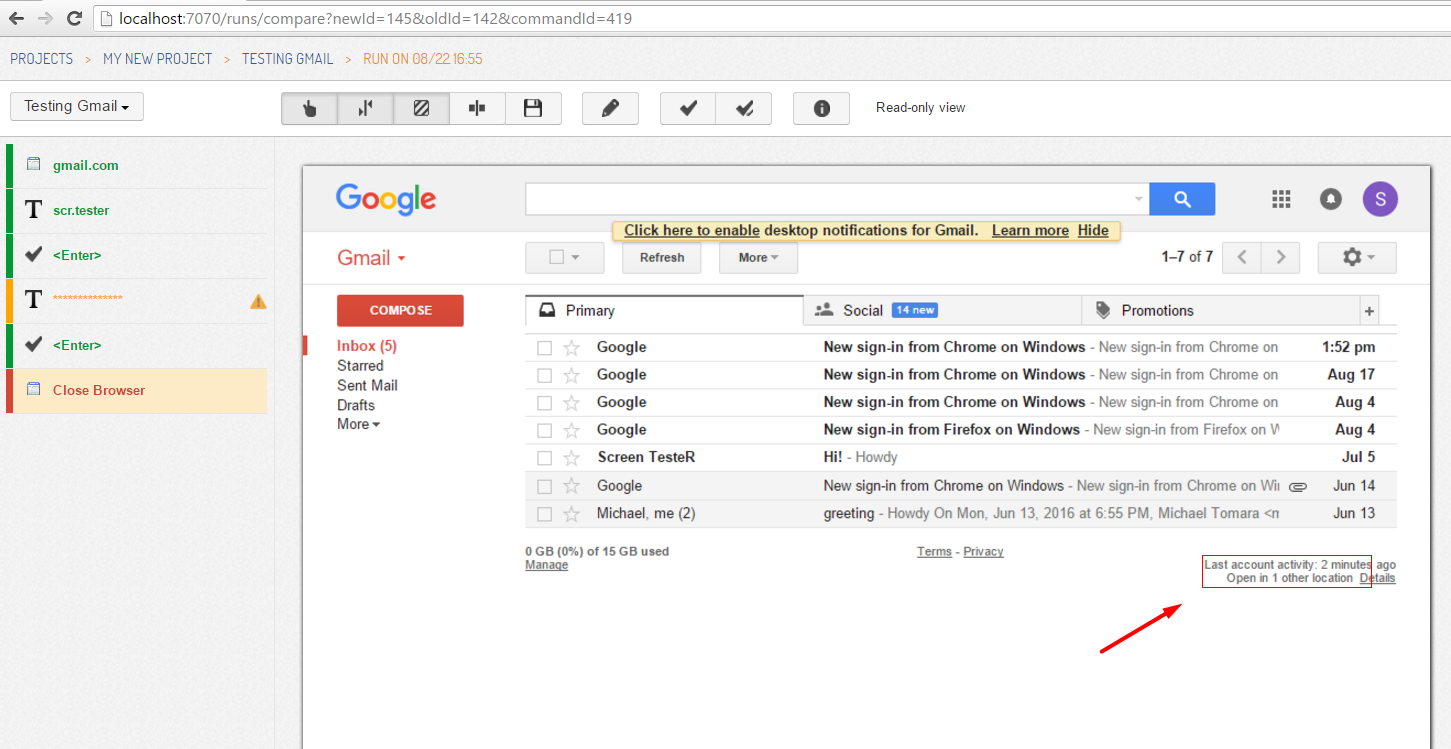
Now Screenster suggests me to re-run this test to detect dynamic regions, which are areas of the UI that change between the runs and do not need to be verified. This means that we will have a first test run and get ‘test’ screenshots to compare with the baseline. I click on ‘Yes’, and Screenster repeats the recorded steps – easy, right? This may take a minute or two, depending on how fast are pages loaded. After the run is over, I can take a look at test results and see if any step fails to match the baseline – if it does, its name in the left would be red-colored. In our case the last one, “Close Browser” is red. I click on it and see the screenshot: it contains red-encircled areas which differ from what was captured during recording (Hint: hovering mouse over such an area opens a popup window with detailed display of differences).

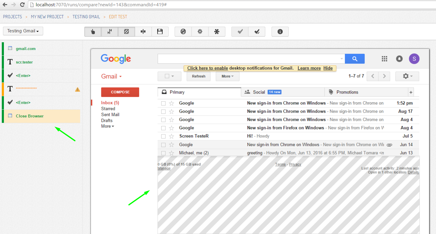
Let us think about the results we got here. The differences are caused by one tiny element showing time passed since the last login. Naturally it will be different each time you enter the account, so this behavior is normal and should not be regarded as a bug by a UI regression testing tool. We can tell Screenster to ignore this element from future comparisons since it is functioning normally. I click on the ‘pencil’ button thus entering the edit mode of this test, then click near the red-encircled area. Clicking several times on the same spot causes the selection of a bigger area: Screenster navigates up the DOM tree allowing you to select larger portions of the UI. I select the entire footer of the Inbox page and click on the ‘Ignore’ button in the top left, then save this ignore rule.

As we can see, the test step turns green if a newly added ignore region covers all differences marked with red. It will remain green after another run unless we change something else on purpose.
Dealing with expected UI changes during automated visual regression testing process
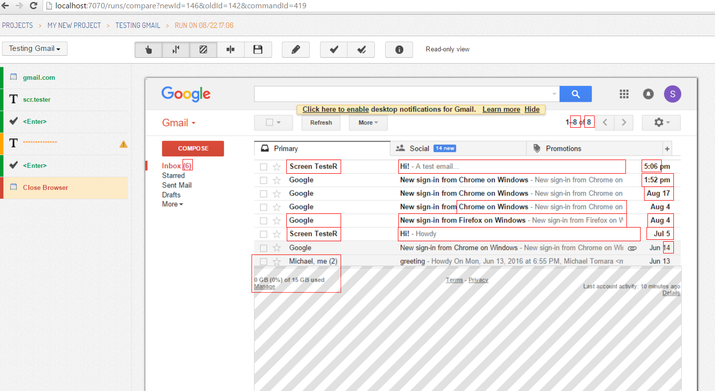
Let us make some changes and see what happens! I will try a most natural thing for an email app: send a message to this account. Better make it short and simple so that it would not be filtered as spam 😉 Once done, I run the test on Screenster again. The last step is red: the screenshot shows significant differences from the baseline because a new email was added to the list.

So, Screenster has detected the changes successfully. But this was another case of correct behavior and we do not need it causing a test failure. After a new email is received, the inbox page will have a new look; and it would be cool to make it a new base for future comparison. Screenster can do that by approving this screenshot to the baseline. I enter the edit mode again, ensure that the “Close Browser” step is selected and click on the “Approve” button. The baseline has been changed successfully and the status of this test is “green” now. We can run it again to detect some real bugs on the Inbox page, if there would be any.
Of course, in a fully functional Gmail test case I’d archive the newly received email so that inbox is returned to its original state. This way my test can run over and over again not generating differences, but I wanted to illustrate Approve To Baseline functionality here.
This was a brief demonstration of Screenster’s abilities when it comes to web UI regression testing automation. Care to try it with your own web app?